A Field Guide to Character Encodings

I recently gave a talk at PyCascades (a regional Python language conference) on character encodings and I thought it would be nice to put together a little primer on a couple different important character encodings.

wood-cube-abc-cube-letters-48898.jpeg
So many characters, so little time.

If you’re unfamiliar with character encodings, they’re just a variety of different systems used to map a string of binary (i.e. 1’s and 0’s) to a specific character. So the Euro character, €, would be represented as “111000101000001010101100” in a character encoding called UTF-8  but “10100100” in the Latin 9 encoding. There are a lot of different character encodings out there, so I’m just going to cover a handful that I think are especially interesting/important. 


  • Name: ASCII
  • Created: 1960
  • Also known as: American Standard Code for Information Interchange, US-ASCII
  • Most often seen: In legacy systems, especially U.S. government databases that need to be backward compatible

ASCII was the first widely-used character encoding. It has space for only 128 characters, and is best suited for English-language data.


  • Name: ISO 8859-1
  • Created: 1985
  • Also known as: Latin 1, code page 819, iso-ir-100, csISOLatin1, latin1, l1, IBM819, WE8ISO8859P1
  • Most often seen: Representing languages not covered by ASCII (like Spanish and Portuguese).

Latin 1 is the most popular of a large set of character encodings developed by the ISO (International Organization for Standardization) to deal with the fact that ASCII only really works well for English by adding additional characters. They did this by adding one extra bit to each character (8 instead of the 7 ASCII uses) so that they had space for 256 characters per encoding. However, since there are a lot of characters out there, there are 16 different ISO encodings that can handle different alphabets. (For example, ISO 8859-5 handles Cyrillic characters, while ISO 8859-11 maps Thai characters.)


  • Name: Windows-1252
  • Created: 1985
  • Also known as: CP-1252,  Latin 1/ISO 8859-1 (which it isn’t!), ANSI, ansinew
  • Most often seen: Mislabelled as Latin 1.

While the ISO was developing a standard set of character encodings, pretty much every large software company was also developing thier own set of proprietary encodings that did pretty much the same thing. Windows-1252 is slightly tweaked version of Latin 1, but Windows also had a bunch of different encodings, as did Apple, as did IBM. The 1980’s were a wild time for character encodings!


  • Name: Shift-JIS
  • Created: 1997
  • Also known as: Shift Japanese Industrial Standards, SJIS, Shift_JIS
  • Most often seen: For Japanese

So one thing you may notice about the character encodings above is that they’re all fairly small, i.e. can’t handle more than 256 characters. But what about a language that has way more than 256 characters, like Japanese? (Japanese has a phonetic writing system with 71 characters, as well as 85,000 kanji characters which each represent a single word.) Well, one solution is to create a different character encoding system specifically for that language with enough space for all the characters you’re going to want to use frequently. But, like with the ASCII-based encodings I talked about above, just one encoding isn’t quite enough to cover all the needs of the language, so a lot of variants and extensions popped up.

JIS and Shift-JIS variants
It’s, uh, fairly complex.

  • Name: UTF-8
  • Created: 1992
  • Also known as: Unicode Transformation Format – 8-bit
  • Most often seen: Pretty much everywhere, including >90% of text on the web. (That’s a good thing!)

Which brings us to UTF-8, the current standard for text encoding. The UTF encodings map from binary to what are known as Unicode codepoints, and then those codepoints are mapped to characters. Why the whole “codepoints” thing in the middle? To help overcome the problems with language-specific encodings that were discussed above. There are over one million codepoints, of which a little over 130,000 have actually been assigned to specific characters. You can update which binary patterns map to which codepoints independently of which codepoints map to which characters. The large number of code points also means that UTF encodings are also pretty future-proof: we have space to add a lot of new characters before we run out. And, in case you’re wondering, there is a single body in charge of determining which code points map to which characters (including emoji!). It’s called the Unicode Consortium and anyone’s free to join.


Like I mentioned, there are lots of different character encodings out there, but knowing about these five and how they’re related will give you a good idea of the complexities of the character encodings landscape. If you’re curious to learn more, the Unicode Standard is a good place to start.
 

Advertisement

How to be wrong: Measuring error in machine learning models

One thing I remember very clearly from writing my dissertation is how confused I initially was about which particular methods I could use to evaluate how often my models were correct or wrong. (A big part of my research was comparing human errors with errors from various machine learning models.) With that in mind, I thought it might be handy to put together a very quick equation-free primer of some different ways of measuring error.

The first step is to figure out what type of model you’re evaluating. Which type of error measurement you use depends on the type of model you’re evaluating. This was a big part of what initially confused me: much of my previous work had been with regression, especially mixed-effects regression, but my dissertation focused on multi-class classification instead. As a result, the techniques I was used to using to evaluate models just didn’t apply.

Today I’m going to talk about three types of models: regression, binary classification and multiclass classification.

Regression

In regression, your goal is to predict the value of an output value given one or more input values. So you might use regression to predict how much a puppy will weigh in four months or the price of cabbage. (If you want to learn more about regression, I recently put together a beginner’s guide to regression with five days of exercises.)

  • R-squared: This is a measurement of how correlated your predicted values are with the actual observed values. It ranges from 0 to 1, with 0 being no correlation and 1 being perfect correlation. In general, models with higher r-squareds are a better fit for your data.
  • Root mean squared error (RMSE), aka standard error: This measurement is an average of how wrong you were for each point you predicted. It ranges from 0 up, with closer to zero being better. Outliers (points you were really wrong about) will disproportionately inflate this measure.

Binary Classification

In binary classification, you aim to predict which of two classes an observation will fall. Examples include predicting whether a student will pass or fail a class or whether or not a specific passenger survived on the Titanic. This is a very popular type of model and there are a lot of ways of evaluating them, so I’m just going to stick to the four that I see most often in the literature.

  • Accuracy: This is proportion of the test cases that your model got right. It ranges from 0 (you got them all wrong) to 1 (you got them all right).
  • Precision: This is a measure of how good your model is at selecting only the members of a certain class. So if you were predicting whether students would pass or not and all of the students you predicted would pass actually did, then your model would have perfect precision. Precision ranges from 0 (none of the observations you said were in a specific class actually were) to 1 (all of the observations you said were in that class actually were). It doesn’t tell you about how good your model is at identifying all the members of that class, though!
  • Recall (aka True Positive Rate, Specificity): This is a measure of how good your model was at finding all the data points that belonged to a specific class. It ranges from 0 (you didn’t find any of them) to 1 (you found all of them). In our students example, a model that just predicted all students would pass would have perfect recall–since it would find all the passing students–but probably wouldn’t have very good precision unless very few students failed.
  • F1 (aka F-Score): The F score is the (harmonic) mean of both precision and recall. It also ranges from 0 to 1. Like precision and recall, it’s calculated based on a specific class you’re interested in. One thing to note about precision, recall and F1 is that they all don’t count true negatives (when you guessed something wasn’t in a specific class and you were right) so if that’s an important consideration for your model you probably shouldn’t rely on these measures.

Multiclass Classification

Multiclass classification is the task of determining which of three or more classes a specific observation belongs to. Things like predicting which icecream flavor someone will buy or automatically identifying the breed of a dog are multiclass classification.

  • Confusion Matrix: One of the most common ways to evaluate multiclass classifications is with a confusion matrix, which is a table with the actual labels along one axis and the predicted labels along the other (in the same order). Each cell of the table has a count value for the number of predictions that fell into that category. Correct predictions will fall along the center diagonal. This won’t give you a single summary measure of a system, but it will let you quickly compare performance across different classes.
  • Cohen’s Kappa: Cohen’s kappa is a measure of how much better than chance a model is at assigning the correct class to an observation. It range from -1 to 1, with higher being better. 0 indicates that the model is at chance levels (i.e. you could do as well just by randomly guessing). (Note that there are some people who will strongly advise against using Cohen’s Kappa.)
  • Informedness (aka Powers’ Kappa): Informedness tells us how likely we are to make an informed decision rather than a random guess. It is the true positive rate (aka recall) plus the true negative rate, minus 1. Like precision, recall and F1, it’s calculated on a class-by-class basis but we can calculate it for a multiclass classification model by taking the (geometric) mean across all of the classes. It ranges from -1 to 1, with 1 being a model that always makes correct predictions, 0 being a model that makes predictions that are no different than random guesses and -1 being a model that always makes incorrect predictions.

Packages for analysis

For R, the Metrics package and caret package both have implementations of these model metrics, and you’ll often find functions for evaluating more specialized models in the packages that contain the models themselves. In Python, you can find implementations of many of these measurements in the scikit-learn module.

Also, it’s worth noting that any single-value metric can only tell you part of the story about a model. It’s important to consider things besides just accuracy when selecting or training the best model for your needs.

Got other tips and tricks for measuring model error? Did I leave out one of your faves? Feel free to share in the comments. 🙂

Data science & kitchen gadgets

One of the things I really enjoy about my current job is chatting with other data science folks. Almost inevitably in the course of these conversations, the old “Python vs. R” debate comes up.

For those of you who aren’t familiar, Python and R are both programming languages often used by data scientists and other folks who work with data. Python is a general-purpose programming language (originally designed as a teaching language) that has some popular packages used for data analysis. R is a computer language specifically designed for doing statistics and visualization. They’re both useful languages, but R is much more specialized.

I use both Python & R, but I tend to prefer R for data analysis and vitalization. I also love kitchen gadgets. (I own and routinely use a melon baller, albeit only very rarely for actually balling melon.) My hypothesis is that my preference for R and love of kitchen gadgets share the same underlying cause: I really like specialized tools.

I was curious to see if there was a similar relationship for other people, so I reached out to my Twitter followers with a simple two-question poll:


Do you prefer Python or R?

  • Python
  • R

How do you feel about specialized kitchen gadgets (e.g. veggie peelers, egg slicers, specialized knives).

  • Hate ’em
  • Love ’em

185 people filled out the poll (if you were one of them, thanks!). Unfortunately for my hypothesis, a quick analysis of the results revealed no evidence that there was any relationship between whether someone prefers Python or R and if they like kitchen gadgets. You can check out the big ol’ null result for yourself:

Regardless of how poorly this experiment illustrates my point, however, it still stands: R is a specialized tool, while Python is general purpose one.

I like to think of R as a bread knife and Python as a pocket knife. It’s much easier to slice bread with a bread knife, but sometimes it’s more convenient to use a pocket knife if you already have it to hand.

If you spend a lot of time cleaning and analyzing data that’s already in a tabular format or doing statistical analysis, you might consider checking out R. It’s certainly saved me a lot of time. (Oh, and I juuuust so happen to have a couple of short R tutorials for folks with little to no programming background.)

Analyzing Multilingual Data

This blog post is a little different from my usual stuff. It’s based on a talk I gave yesterday at the first annual Data Institute Conference. As a result, it’s aimed at a slightly more technical audience than my usual stuff, but I hope I’ve done an ok job keeping it accessible. Feel free to drop me a comment if you have any questions or found anything confusing and I’ll be sure to help you out.
You can play with the code yourself by forking this notebook on Kaggle (you don’t even have to download or install anything :).

There are over 7000 languages in the world, 80% of which have fewer than a million speakers each. In fact, six in ten people on Earth speak a language with less than ten million speakers. In other words: the majority of people on Earth use low-resource languages.

As a result, any large sample of user-generated text is almost guaranteed to have multiple languages in it. So what can you do about it? There are a couple options:

  1. Ignore it
  2. Only look at the parts of the data that are in English
  3. Break the data apart by language & use language-specific tools when available

Let’s take a quick look at the benefits and drawbacks of each approach.


Getting started

In [1]:
# import libraries we'll use
import spacy # fast NLP
import pandas as pd # dataframes
import langid # language identification (i.e. what language is this?)
from nltk.classify.textcat import TextCat # language identification from NLTK
from matplotlib.pyplot import plot # not as good as ggplot in R :p

To explore working with multilingual data, let’s look a real-life dataset of user-generated text. This dataset contains 10,502 tweets, randomly sampled from all publicly available geotagged Twitter messages. It’s a realistic cross-section of the type of linguistic diversity you’ll see in a large text dataset.

# read in our data
tweetsData = pd.read_csv("../input/all_annotated.tsv", sep = "\t")

# check out some of our tweets
tweetsData['Tweet'][0:5]
0                            Bugün bulusmami lazimdiii
1       Volkan konak adami tribe sokar yemin ederim :D
2                                                  Bed
3    I felt my first flash of violence at some fool...
4              Ladies drink and get in free till 10:30
Name: Tweet, dtype: object

Option 1: Ignore the multilingualism

Maybe you’ve got a deadline coming up fast, or maybe you didn’t get a chance to actually look at some of your text data and just decide to treat it as if it were English. What could go wrong?

To find out, let’s use Spacy to tokenize all our tweets and take a look at the longest tokens in our data.

Spacy is an open-source NLP library that is much faster than the Natural Language Toolkit, although it does not have as many tasks implemented. You can find more information in the Spacy documentation.

# create a Spacy document of our tweets
# load an English-language Spacy model
nlp = spacy.load("en")

# apply the english language model to our tweets
doc = nlp(' '.join(tweetsData['Tweet']))

Now let’s look at the longest tokens in our Twitter data.

sorted(doc, key=len, reverse=True)[0:5]
[a7e78d48888a6811d84e0759e9387647447d1e74d8c7c4f1bec00d318e4e5030f08eb35668a97873820ca1d9dc61ffb620f8992296f3b029a60f153beac8018f5fb77d000000,
 e44337d70d7a7fec79a8b6bd8aa573367224023e4272f22af6d0844d9682d5b48062e331b33ab3b92dac2c262ed4f154ba679ad07b30d2cf1c15851cdac901315b4e72000000,
 3064d36c909f9d437f7a3f405aa550f65529566547ae2308d6c4f2585250106d33b924ae9c8dcc08856e41f611d9bd15409a79f7ba21d318ab484f0cae10017201590a000000,
 69bdf5177f1ae8ed61ed71c477f7dc415b97a2b2d7e57be079feb1a2c52600a996fd0891e130c1ce13c94e4406f83ba59e5edb5a7e0fb45e5251a17bb29601081f3de0000000,
 lt;3<3<3<3<3<3<3<3<3<3<3<3<3<3<3<3<3<3<3<3<3<3<3<3<3<3<3]

The five longest tokens are entire tweets, four produced by an art bot that tweets hashes of Unix timestamps and one that’s just the HTML version of “<3” tweeted a bunch of times. In other words: normal Twitter weirdness. This is actual noise in the data and can be safely discarded without hurting downstream tasks, like sentiment analysis or topic modeling.

sorted(doc, key=len, reverse=True)[6:10]
[卒業したった(*^^*)\n彼女にクラスで一緒にいるやつに\nたった一人の同中の拓夢とも写真撮れたし満足や!(^。^)時間ギリギリまでテニスやってたからテニス部面と写真撮ってねーわ‼︎まぁこいつらわこれからも付き合いあるだろうからいいか!,
 眼鏡は近視用で黒のセルフレームかアンダーリムでお願いします。オフの日は赤いセルフレームです。形状はサークルでお願いします。30代前半です。髪型ボブカットもしくはティモシェンコ元ウクライナ首相みたいなので。色は黒目でとりあえずお願いします,
 普段は写真撮られるの苦手なので、\n\n顔も出さずw\n\n登場回数少ないですが、\n\n元気にampで働いておりますw\n\n一応こんな人が更新してますのでw\n\n#takahiromiyashitathesolois,
 love#instagood#me#cute#tbt#photooftheday#instamood#tweegram#iphonesia#picoftheday#igers#summer#girl#insta]

The next five longest tokens are also whole tweets which have been identified as single tokens. In this case, though, they were produced by humans!

The tokenizer (which assumes it will be given mainly English data) fails to correct tokenize these tweets because it’s looking for spaces. These tweets are in Japanese, though, and like many Asian languages (including all varieties of Chinese, Korean and Thai) they don’t actually use spaces between words.

In case you’re curious, “、” and “。” are single characters and don’t contain spaces! They are, respectively, the ideographic comma and ideographic full stop, and are part of a very long list of line breaking characters associated with specific orthographic systems.

In order to correctly tokenize Japanese, you’ll need to use a language-specific tokenizer.

The takeaway: if you ignore multiple languages, you’ll end up violating the assumptions behind major out-of-the-box NLP tools


Option 2: Only look at the parts of the data that are in English

So we know that just applying NLP tools designed for English willy-nilly won’t work on multiple languages. So what if we only grabbed the English-language data and then worked with that?

There are two big issues here:

  • Correctly identifying which tweets are in English
  • Throwing away data

Correctly identifying which tweets are in English

Probably the least time-intensive way to do this is by attempting to automatically identify the language that each Tweet is written in. A BIG grain of salt here: automatic language identifiers are very error prone, especially on very short texts. Let’s check out two of them.

  • LangID: Lui, Marco and Timothy Baldwin (2011) Cross-domain Feature Selection for Language Identification, In Proceedings of the Fifth International Joint Conference on Natural Language Processing (IJCNLP 2011), Chiang Mai, Thailand, pp. 553—561. Available from http://www.aclweb.org/anthology/I11-1062
  • TextCat: Cavnar, W. B. and J. M. Trenkle, “N-Gram-Based Text Categorization” In Proceedings of Third Annual Symposium on Document Analysis and Information Retrieval, Las Vegas, NV, UNLV Publications/Reprographics, pp. 161-175, 11-13 April 1994.

First off, here are the languages the first five tweets are actually written in, hand tagged by a linguist (i.e. me):

  1. Turkish
  2. Turkish
  3. English
  4. English
  5. English

Now let’s see how well two popular language identifiers can detect this.

# summerize the labelled language
tweetsData['Tweet'][0:5].apply(langid.classify)
0     (az, -30.30187177658081)
1     (ms, -83.29260611534119)
2      (en, 9.061840057373047)
3    (en, -195.55468368530273)
4     (en, -98.53013229370117)
Name: Tweet, dtype: object

LangID does…alright, with three out of five tweets identified correctly. While it’s pretty good at identifying English, the first tweet was identified as Azerbaijani and the second tweet was labeled as Malay, which is very wrong (not even in the same language family as Turkish).

Let’s look at another algorithm, TextCat, which is based on character-level N-Grams.

# N-Gram-Based Text Categorization
tc = TextCat()

# try to identify the languages of the first five tweets again
tweetsData['Tweet'][0:5].apply(tc.guess_language)
0    tur
1    ind
2    bre
3    eng
4    eng
Name: Tweet, dtype: object

TextCat also only got three out of the five correct. Oddly, it identifier “bed” as Breton. To be fair, “bed” is the Breton word for “world”, but it’s still a bit odd.

The takeaway: Automatic language identification, especially on very short texts, is very error prone. (I’d recommend using multiple language identifiers & taking the majority vote.)

Throwing away data

Even if language identification were very accurate, how much data would be just be throwing away if we only looked at data we were fairly sure was English?

Note: I’m only going to LangID here for time reasons, but given the high error rate I’d recommend using multiple language identification algorithms.

# get the language id for each text
ids_langid = tweetsData['Tweet'].apply(langid.classify)

# get just the language label
langs = ids_langid.apply(lambda tuple: tuple[0])

# how many unique language labels were applied?
print("Number of tagged languages (estimated):")
print(len(langs.unique()))

# percent of the total dataset in English
print("Percent of data in English (estimated):")
print((sum(langs=="en")/len(langs))*100)
Number of tagged languages (estimated):
95
Percent of data in English (estimated):
40.963625976

Only 40% of our data has been tagged as English by LangId. If we throw the rest of it, we’re going to lose more than half of our dataset! Especially if this is data you spent a lot of time and money collecting, that seems downright wasteful. (Plus, it might skew our analysis.)

So if 40% of our data is in English, what is the other 60% made up of? Let’s check out the distribution data across languages in our dataset.

# convert our list of languages to a dataframe
langs_df = pd.DataFrame(langs)

# count the number of times we see each language
langs_count = langs_df.Tweet.value_counts()

# horrible-looking barplot (I would suggest using R for visualization)
langs_count.plot.bar(figsize=(20,10), fontsize=20)

There’s a really long tail on our dataset; most that were identified in our dataset were only identified a few times. This means that we can get a lot of mileage out of including just a few more popular languages in our analysis. How much will we gain, exactly?

print("Languages with more than 400 tweets in our dataset:")
print(langs_count[langs_count > 400])

print("")

print("Percent of our dataset in these languages:")
print((sum(langs_count[langs_count > 400])/len(langs)) * 100)
Languages with more than 400 tweets in our dataset:
en    4302
es    1020
pt     751
ja     436
tr     414
id     407
Name: Tweet, dtype: int64

Percent of our dataset in these languages:
69.7962292897

By including only five more languages in our analysis (Spanish, Portugese, Japanese, Turkish and Indonesian) we can increase our coverage of the data in our dataset by almost a third!

The takeaway: Just incorporating a couple more languages in your analysis can give you access to a lot more data!


Option 3: Break the data apart by language & use language-specific tools

Ok, so what exactly does this pipeline look like? Let’s look at just the second most popular language in our dataset: Spanish. What happens when we pull out just the Spanish tweets & tokenize them?

# get a list of tweets labelled "es" by langid
spanish_tweets = tweetsData['Tweet'][langs == "es"]

# load a Spanish-language Spacy model
from spacy.es import Spanish
nlp_es = Spanish(path=None)

# apply the Spanish language model to our tweets
doc_es = nlp_es(' '.join(spanish_tweets))

# print the longest tokens
sorted(doc_es, key=len, reverse=True)[0:5]
[ViernesSantoEnElColiseoRobertoClemente,
 MiFantasia1DEnWembleyConCocaColaFM,
 fortaleciéndonos','escenarios,
 DirectionersConCocaColaFM1D,
 http://t.co/ezZEsXN3MF\nvia]

This time, the longest tokens are Spanish-language hashtags. This is exactly the sort of thing we’d expect to see! From here, we can use this tokenized dataset to feed into other downstream like sentiment analysis.

Of course, it would be impractical to do this for every single language in our dataset, even if we could be sure that they were all identified correctly. You’re probably going to have to accept that you probably won’t be able to consider every language in your dataset unless you can commit a lot of time. But including any additional language will enrich your analysis!

The takeaway: It doesn’t have to be onerous to incorporate multiple languages in your analysis pipeline!


So let’s review our options for analyzing multilingual data:

Option 1: Ignore Multilingualism

As we saw, this option will result in violating a lot of the assumptions built into NLP tools (e.g. there are spaces between words). If you do this, you’ll end up with a lot of noise and headaches as you try to move through your analysis pipeline.

Option 2: Only look at English

In this dataset, only looking at English would have led to us throwing away over half of our data. Especailly as NLP tools are developed and made avaliable for more and more languages, there’s less reason to stick to English-only NLP.

Option 3: Seperate your data by language & analyze them independently

This does take a little more work than the other options… but not that much more, especially for languages that already have resources avalialbe for them.

Additional resources:

Language Identification:

Here are some pre-built language identifiers to use in addition to LandID and TextCat:

Dealing with texts which contain multiple languages (code switching):

It’s very common for a span of text to include multiple languages. This example contains English and Malay (“kain kain” is Malay for “unwrap”):

Roasted Chicken Rice with Egg. Kain kain! 🙂 [Image of a lunch wrapped in paper being unwrapped.]

How to automatically handle code switching is an active research question in NLP. Here are some resources to get you started learning more:


Dance Your PhD: Modeling the Perceptual Learning of Novel Dialect Features

Today’s blog post is a bit different. It’s in dance!

If that wasn’t quite clear enough for you, you can check this blog post for a more detailed explanation.

Where can you find language data on the web?

In the course of my day-to-day work on Kaggle’s public data platform, I’ve learned a lot about the ecosystem of language data on the web (or at least the portions of it that have been annotated in English). For example, I’ve noticed a weird disconnect between European and American data repositories  resources that I’m pretty sure has its roots in historical and disciplinary divisions.

Computer Used to Create Printouts of Data (FDA 097) (8250815324)

I’ve also found a lot of great resources, though! At some point, I started keeping notes on interesting data repositories and link aggregators. I finally got around to tidying up and annotating my list of resources, and I figured that it would a useful thing to share with everyone. So, without further ado, here’s an (incomplete) list of some places to find language resources on the web:

  • META-SHARE
    • URL :http://www.meta-share.org/
    • META-SHARE has a lot of resources from The International Conference on Language Resources and Evaluation (LREC) on it.
  • Trolling
  • Linguistic Data Consortium (LDC)
    • URL: https://www.ldc.upenn.edu/
    • The Linguistic Data Consortium is an international non-profit that offers archival hosting of datasets. The data offered by them is high quality and usually not free (although they offer data grants for students).
  • Kaggle
    • URL: https://www.kaggle.com/datasets?search=corpus
    • Kaggle’s public data platform has a lot of language/NLP datasets available on it, many not in English. You can also do data analysis on Kaggle (with R or Python) without having to download anything or set up a local environment.
  • European Language Resources Association
  • Zenodo
    • URL: https://zenodo.org/
    • Hosted by CERN, has datasets (including corpora) from a wide variety of disciplines.
  • Document the Now
    • URL: http://www.docnow.io/catalog/
    • Contains lists of Tweet ID’s surrounding certain events. You’ll need to use the “rehydrator” to get the actual tweets.
  • International Standard Language Resource Number
    • URL: http://www.islrn.org/resources/identify_name/  (a list of unique ID #’s associated with language resources)
    • Like a digital object identifier (DOI) for language resources. Not the best search (only looks at the title)  but if you have a specific phrase you’re looking for it can be a good way to discover new resources.
  • Language & Culture Archives (SIL)
  • Open Language Archives Community (OLAC)
  • Free sound
  • GitHub
    • URL:  https://github.com/search?q=corpus
    • You can sometimes find interesting & high quality language data on Github, but it’s not centralized and of widely varying quality.
  • Re3data.org
  • Language Gold Mine

Know of a resource I forgot to include? Link it in the comments!

How well do Google and Microsoft and recognize speech across dialect, gender and race?

If you’ve been following my blog for a while, you may remember that last year I found that YouTube’s automatic captions didn’t work as well for some dialects, or for women. The effects I found were pretty robust, but I wanted to replicate them for a couple of reasons:

  • I only looked at one system, YouTube’s automatic captions, and even that was over a period of several years instead of at just one point in time. I controlled for time-of-upload in my statistical models, but it wasn’t the fairest system evaluation.
  • I didn’t control for the audio quality, and since speech recognition is pretty sensitive to things like background noise and microphone quality, that could have had an effect.
  • The only demographic information I had was where someone was from. Given recent results that find that natural language processing tools don’t work as well for African American English, I was especially interested in looking at automatic speech recognition (ASR) accuracy for African American English speakers.

With that in mind, I did a second analysis on both YouTube’s automatic captions and Bing’s speech API (that’s the same tech that’s inside Microsoft’s Cortana, as far as I know).

Speech Data

For this project, I used speech data from the International Dialects of English Archive. It’s a collection of English speech from all over, originally collected to help actors sound more realistic.

I used speech data from four varieties: the South (speakers from Alabama), the Northern Cities (Michigan), California (California) and General American. “General American” is the sort of news-caster style of speech that a lot of people consider unaccented–even though it’s just as much an accent as any of the others! You can hear a sample here.

For each variety, I did an acoustic analysis to make sure that speakers I’d selected actually did use the variety I thought they should, and they all did.

Systems

For the YouTube captions, I just uploaded the speech files to YouTube as videos and then downloaded the subtitles. (I would have used the API instead, but when I was doing this analysis there was no Python Google Speech API, even though very thorough documentation had already been released.)

Bing’s speech API was a little  more complex. For this one, my co-author built a custom Android application that sent the files to the API & requested a long-form transcript back. For some reason, a lot of our sound files were returned as only partial transcriptions. My theory is that there is a running confidence function for the accuracy of the transcription, and once the overall confidence drops below a certain threshold, you get back whatever was transcribed up to there. I don’t know if that’s the case, though, since I don’t have access to their source code. Whatever the reason, the Bing transcriptions were less accurate overall than the YouTube transcriptions, even when we account for the fact that fewer words were returned.

Results

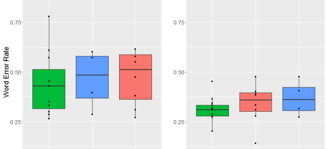
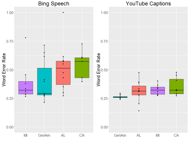
OK, now to the results. Let’s start with dialect area. As you might be able to tell from the graphs below, there were pretty big differences between the two systems we looked at. In general, there was more variation in the word error rate for Bing and overall the error rate tended to be a bit higher (although that could be due to the incomplete transcriptions we mentioned above). YouTube’s captions were generally more accurate and more consistent. That said, both systems had different error rates across dialects, with the lowest average error rates for General American English.

dialect
Differences in Word Error Rate (WER) by dialect were not robust enough to be significant for Bing (under a one way ANOVA) (F[3, 32] = 1.6, p = 0.21), but they were for YouTube’s automatic captions (F[3, 35] = 3.45,p < 0.05). Both systems had the lowest average WER for General American.
Now, let’s turn to gender. If you read my earlier work, you’ll know that I previously found that YouTube’s automatic captions were more accurate for men and less accurate for women. This time, with carefully recorded speech samples, I found no robust difference in accuracy by gender in either system. Which is great! In addition, the unreliable trends for each system pointed in opposite ways; Bing had a lower WER for male speakers, while YouTube had a lower WER for female speakers.

So why did I find an effect last time? My (untested) hypothesis is that there was a difference in the signal to noise ratio for male and female speakers in the user-uploaded files. Since women are (on average) smaller and thus (on average) slightly quieter when they speak, it’s possible that their speech was more easily masked by background noises, like fans or traffic. These files were all recorded in a quiet place, however, which may help to explain the lack of difference between genders.

gender
Neither Bing (F[1, 34] = 1.13, p = 0.29), nor YouTube’s automatic captions (F[1, 37] = 1.56, p = 0.22) had a significant difference in accuracy by gender.
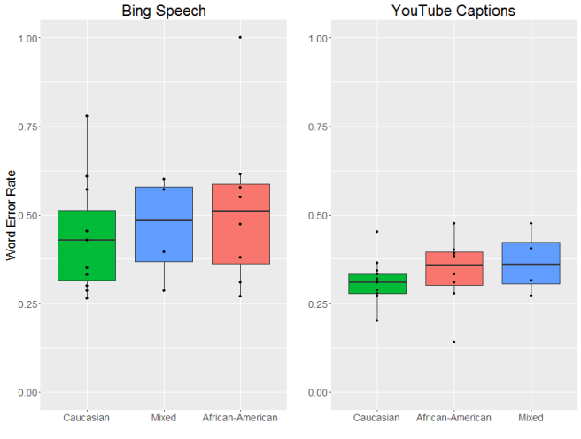
Finally, what about race? For this part of the analysis, I excluded General American speakers, since they did not report their race. I also excluded the single Native American speaker. Even with fewer speakers, and thus reduced power, the differences between races were still robust enough to be significant for YouTube’s automatic captions and Bing followed the same trend. Both systems were most accurate for Caucasian speakers.

ethnicity
As with dialect, differences in WER between races were not significant for Bing (F[4, 31] = 1.21, p = 0.36), but were significant for YouTube’s automatic captions (F[4, 34] = 2.86,p< 0.05). Both systems were most accurate for Caucasian speakers.
While I was happy to find no difference in performance by gender, the fact that both systems made more errors on non-Caucasian and non-General-American speaking talkers is deeply concerning. Regional varieties of American English and African American English are both consistent and well-documented. There is nothing intrinsic to these varieties that make them less easy to recognize. The fact that they are recognized with more errors is most likely due to bias in the training data. (In fact, Mozilla is currently collecting diverse speech samples for an open corpus of training data–you can help them out yourself.)

So what? Why does word error rate matter?

There are two things I’m really worried about with these types of speech recognition errors. The first is higher error rates seem to overwhelmingly affect already-disadvantaged groups. In the US, strong regional dialects tend to be associated with speakers who aren’t as wealthy, and there is a long and continuing history of racial discrimination in the United States.

Given this, the second thing I’m worried about is the fact that these voice recognition systems are being incorporated into other applications that have a real impact on people’s lives.

Every automatic speech recognition system makes errors. I don’t think that’s going to change (certainly not in my lifetime). But I do think we can get to the point where those error don’t disproportionately affect already-marginalized people. And if we keep using automatic speech recognition into high-stakes situations it’s vital that we get to that point quickly and, in the meantime, stay aware of these biases.

If you’re interested in the long version, you can check out the published paper here.

Can your use of capitalization reveal your political affiliation?

This week, I’m in Vancouver this week for the meeting of the Association for Computational Linguistics. (On the subject of conferences, don’t forget that my offer to help linguistics students from underrepresented minorities with the cost of conferences still stands!) The work I’m presenting is on a new research direction I’m pursuing and I wanted to share it with y’all!

If you’ve read some of my other posts on sociolinguistics, you may remember that the one of its central ideas is that certain types of language usage pattern together with aspects of people’s social identities. In the US, for example, calling a group of people “yinz” is associated with being from Pittsburgh. Or in Spanish, replacing certain “s” sounds with “th” sounds is associated with being from northern or central Spain. When a particular linguistic form is associated with a specific part of someone’s social identity, we call that a “sociolinguistic variable”

There’s been a lot of work on the type of sociolinguistic variables people use when they’re speaking, but there’s been less work on what people do when they’re writing. And this does make a certain amount of sense: many sociolinguistic variables are either 1) something people aren’t aware they’re doing or 2) something that they’re aware they’re doing but might not consider “proper”. As a result, they tend not to show up in formal writing.

This is where the computational linguistics part comes in; people do a lot of informal writing on computers, especially on the internet. In fact, I’d wager that humans are producing more text now than at any other point in history, and a lot of it is produced in public places. That lets us look for sociolinguistics variables in writing in a way that wasn’t really possible before.

Which is a whole lot of background to be able to say: I’m looking at how punctuation and capitalization pattern with political affiliation on Twitter.

Political affiliation is something that other sociolinguists have definitely looked at. It’s also something that’s very, very noticeable on Twitter these days. This is actually a boon to this type of research. One of the hard things about doing research on Twitter is that you don’t always necessarily know someone’s social identity. And if you use a linguistic feature to try to figure out their identity when what you’re interested in is linguistic features, you quickly end up with the problem of circular logic.

Accounts which are politically active, however, will often explicitly state their political affiliation in their Twitter bio. And I used that information to get tweets from people I was very sure had a specific political affiliation.

For this project, I looked at people who use the hashtags #MAGA and #theResistance in their Twitter bios. The former is an initialism for “Make America Great Again” and is used by politically conservative folks who support President Trump. The latter is used by political liberal folks who are explicitly opposed to President Trump. These two groups not only have different political identities, but also are directly opposed to each other. This means there’s good reason to believe that they will use language in different ways that reflect that identity.

But what about the linguistic half of the equation? Punctuation and capitalization are especially interesting to me because they seem to be capturing some of the same information we might find in prosody or intonation in spoken language. Things like YELLING or…pausing….or… uncertainty?  They’re also much, much easier to measure punctuation than intonation, which is notoriously difficult and time-consuming to annotate.  At the same time, I have good evidence that how you use punctuation and capitalization has some social meaning. Check out this tweet, for example:

0b1022106daeb0d0419263dcf9c5aa93--this-is-me-posts
As this tweet shows, putting a capital letter at the beginning of a tweet is anything but “aloof and uninterested yet woke and humorous”.

So, if punctuation and capitalization are doing something socially, is part of what they’re doing expressing political affiliation?

That’s what I looked into. I grabbed up to 100 tweets each from accounts which used either #MAGA or #theResistance in their Twitter bios. Then I looked at how much punctuation and capitalization users from these two groups used in their tweets.

Punctuation

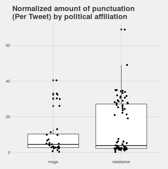
First, I looked at all punctuation marks. I did find that, on average, liberal users tended to use less punctuation. But when I took a closer look at the data, an interesting pattern emerged. In both the liberal and conservative groups, there were two clusters of users: those who used a lot of punctuation and those who used almost none.

punctuation
Politically liberal users on average tended to use less punctuation than politically conservative users, but in both groups there’s really two sets of users: those who use a lot of punctuation and those who use basically  none. There just happen to be more of the latter in #theResistance.

What gives rise to these two clusters? I honestly don’t know, but I do have a hypothesis. I think that there’s  probably a second social variable in this data that I wasn’t able to control for. It seems likely that the user’s age might have something to do with it, or their education level, or even whether they use thier Twitter account for professional or personal communication.

Capitalization

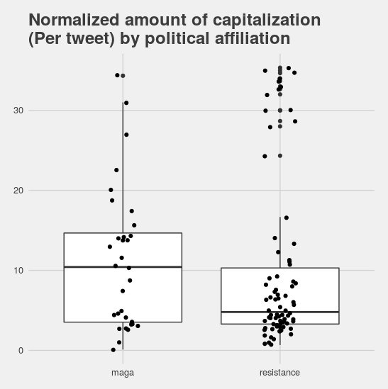
My intuition that there’s a second latent variable at work in this data is even stronger given the results for the amount of capitalization folks used. Conservative users tended to use more capitalization than the average liberal user, but there was a really strong bi-modal distribution for the liberal accounts.

Rplot
Again, we see that conservative accounts use more of the marker (in this case capitalization), but that there’s a strong bi-modal distribution in the liberal users’ data.

What’s more, the liberal accounts that used a lot of punctuation also tended to use a lot of capitalization. Since these features are both ones that I associate with very “proper” usage (things like always starting a tweet with a capital letter, and ending it with a period) this seems to suggest that some liberal accounts are very standardized in their use of language, while others reject at least some of those standards.

So what’s the answer the question I posed in the title? Can capitalization or punctuation reveal political affiliation? For now, I’m going to go with a solid “maybe”. Users who use very little capitalization and punctuation are more likely to be liberal… but so are users who use a lot of both. And, while I’m on the subject of caveats, keep in mind that I was only looking at very politically active accounts who discuss thier politics in their user bios.  These observations probably don’t apply to all Twitter accounts (and certainly not across different languages).

If you’re interested in reading more, you can check out the fancy-pants versions of this research here and here.  And I definitely intend to consider looking at this; I’ll keep y’all posted on my findings. For now, however, off to find me a Nanimo bar!

Where 👏 do 👏 the 👏 claps 👏 go 👏 when 👏 you 👏 write 👏 like 👏 this 👏?

You may already be familiar with the phenomena I’m going to be talking about today: when someone punctuates some text with the clap emoji. It’s a pretty transparent gestural scoring and (for me) immediately brings to mind the way my mom would clap with every word when she was particularly exasperated with my sibling and I (it was usually along with speech like “let’s go, let’s go, let’s go” or “get up now”). It looks like so:

This innovation, which started on Black Twitter is really interesting to me because it ties in with my earlier work on emoji ordering. I want to know where emojis go, particularly in relation to other words. Especially since people have since extended this usage to other emoji, like the US Flag:

Logically, there are several different ways you can intersperse clap emojis with text:

  • Claps 👏  are 👏 used 👏 between 👏 every 👏 word.
  •  👏 Claps 👏 are 👏 used 👏 around 👏 every 👏 word. 👏
  •  👏 Claps 👏 are 👏 used 👏 before 👏 every 👏 word.
  • Claps 👏 are 👏 used 👏 after 👏 every 👏 word. 👏
  • Claps 👏 are used 👏 between phrases 👏 not words

I want to know which of these best describes what people actually do. I’m not aiming to write an internet style guide, but I am hoping to characterize this phenomena in a general way: this is how most people who do this do it, and if you want to use this style in a natural way, you should probably do it the same way.

Data

I used Fireant to grab 10,000 tweets from the Twitter streaming API which had the clap emoji in them at least once. (Twitter doesn’t let you search for a certain number of matches of the same string. If you search for “blob” and “blob blob” you’ll get the same set of results.)

Analysis

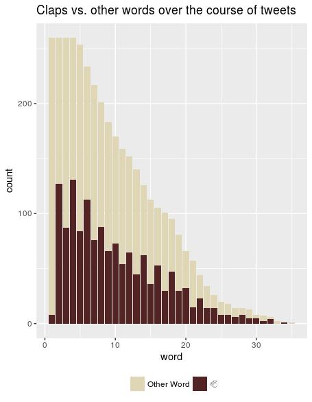
From that set of 10,000 tweets, I took only the tweets that had a clap emoji followed by a word followed by another clap emoji and threw out any repeats. That left me with 260 tweets. (This may seem pretty small compared to my starting dataset, but there were a lot of retweets in there, and I didn’t want to count anything twice.) Then I removed @usernames, since those show up in the beginning of any tweet that’s a reply to someone, and URL’s, which I don’t really think of as “words”. Finally, I looked at each word in a tweet and marked whether it was a clap or not. You can see the results of that here:

timecourse

The “word” axis represents which word in the tweet we’re looking at: the first, second, third, etc. The red portion of the bar are the words that are the clap emoji. The yellow portion is the words that aren’t. (BTW, big shoutout to Hadley Wickham’s emo(ji) package for letting me include emoji in plots!)

From this we can see a clear pattern: almost no one starts a tweet with an emoji, but most people follow the first word with an emoji. The up-down-up-down pattern means that people are alternating the clap emoji with one word. So if we look back at our hypotheses about how emoji are used, we can see right off the bat that three of them are wrong:

  • Claps 👏  are 👏 used 👏 between 👏 every 👏 word.
  •  👏 Claps 👏 are 👏 used 👏 around 👏 every 👏 word. 👏
  •  👏 Claps 👏 are 👏 used 👏 before 👏 every 👏 word.
  • Claps 👏 are 👏 used 👏 after 👏 every 👏 word. 👏
  • Claps 👏 are used 👏 between phrases 👏 not words

We can pick between the two remaining hypotheses by looking at whether people are ending thier tweets with a clap emoji. As it turns out, the answer is “yes”, more often than not.

endWithClap

If they’re using this clapping-between-words pattern (sometimes called the “ratchet clap“) people are statistically more likely to end their tweet with a clap emoji than with a different word or non-clap emoji. This means the most common pattern is to use 👏 a 👏 clap 👏 after 👏 every 👏 word, 👏  including  👏 the  👏 last. 👏

This makes intuitive sense to me. This pattern is mimicking someone is clapping on every word. Since we can’t put emoji on top of words to indicate that they’re happening at the same time, putting them after makes good intuitive sense. In some sense, each emoji is “attached” to the word that comes before it in a similar way to how “quickly” is “attached” to “run” in the phrase “run quickly”. It makes less sense to put emoji between words, becuase then you end up with less claps than words, which doesn’t line up well with the way this is done in speech.

The “clap after every word” pattern is also what this website that automatically puts claps in your tweets does, so I’m pretty positive this is a good characterization of community norms.


So there you have it! If you’re going to put clap emoji in your tweets, you should probably do 👏 it 👏 like 👏 this. 👏 It’s not wrong if you don’t, but it does look kind of weird.

Contest announcement! Making noise and going places ✈️🛄

I recently wrote the acknowledgements section my dissertation and it really put into perspective how much help I’ve received during my degree. I’ve decided to pass some of that on by helping out others! Specifically, I’ve decided to help make travelling to conferences a little more affordable for linguistics students who are from underrepresented minorities (African American, American Indian/Alaska Native, or Latin@), LGBT or have a disability.

Biologist speaking at the Friday morning Town Hall session, where attendees were welcome to discuss their ideas on how to further landscape conservation. (5471417317)

To enter:

Entry is open to any student (graduate or undergraduate) studying any aspect of language (broadly defined) who is from an underrepresented minority (African American, American Indian/Alaska Native, or Latin@), LGBT or has a disability.  E-mail me and attach:

  • An abstract or paper that has been accepted at an upcoming (i.e. starting after June 23, 2017) conference
  • The acceptance letter/email from the conference
  • A short biography/description of your work

One entry per person, please!

Prizes:

I’ll pick up to two entries. Each winner will receive 100 American dollars to help them with costs associated with the conference, and I’ll write a blog post highlighting each winner’s research.

Contest closes July 31I’ll contact winners by July 5

Good luck!